4.5 Barcharts
The barchart command is used to create bar charts. You specify the relevant variable(s) and the statistic(s) that the bars should represent. Through the over() or by() option, you can distribute the bars over one or more other variables that must be categorical (e.g. gender).
Syntax:
barchart(<statistic>) <variable/variable list> [, <options>]
You decide what kind of values you want to create bar charts on by specifying a type of statistic in the parenthesis behind the command. These can be divided into two main categories:
-
Frequencies (counts) and percentages
-
Summary statistics (averages, median, standard deviation, sum, etc.)
Frequencies and percentages
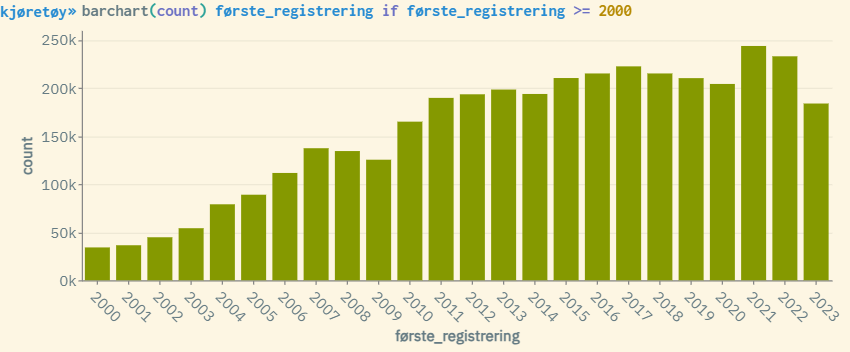
The variants barchart(count) and barchart(percent) show respectively the number and percentages for categorical variables presented as bars, and are in practice a graphical presentation of numbers generated through the tabulate command. You should preferably only specify one variable if you are using these two types of measures. It is possible to specify several variables, but the bar presentation can quickly become complex as a bar will be displayed for each category combination of the variables you specify (if all variables have many categories, there will be very many bars).
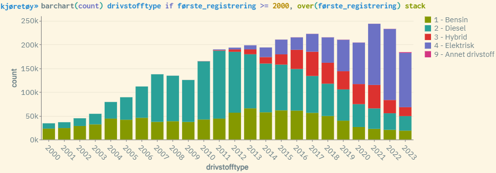
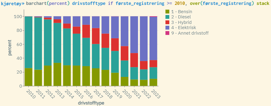
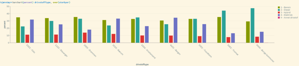
If you want to show bars grouped by optional categories, use the over() option where you specify the categories by specifying at least one categorical variable inside the parenthesis. By combining over() with stack, you can create more advanced and informative category combinations, and the diagram then becomes more compact and clear (especially useful if you have many categories).
It is also possible to create separate bar charts for each category specified by a specific categorical variable. The by() option can be used for this. Unlike over(), by() creates complete bar diagrams for each value of one or more categorical variables.
Examples:
Summary statistics
Barchart can also be used to create bar presentations of summary statistics, such as averages, medians, etc. This requires that the variable(s) are numerical, and is in practice a graphical way to show corresponding values through the statistical command summarize.
The following variants can be used:
-
barchart(mean) -
barchart(median) -
barchart(sd) -
barchart(min) -
barchart(max) -
barchart(sum)
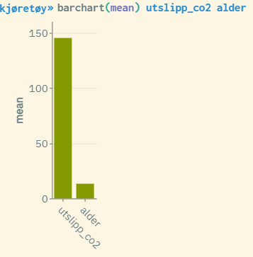
Unlike bar charts for frequencies and percentages, you can specify as many variables (numerical) as you wish, in the same way as for summarize. The diagram then shows one bar with the relevant statistical type for each variable specified.
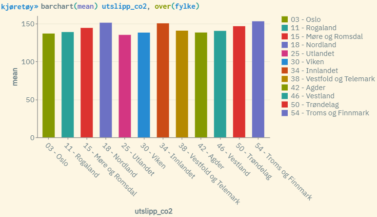
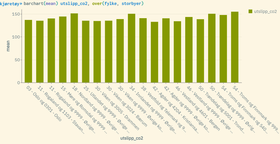
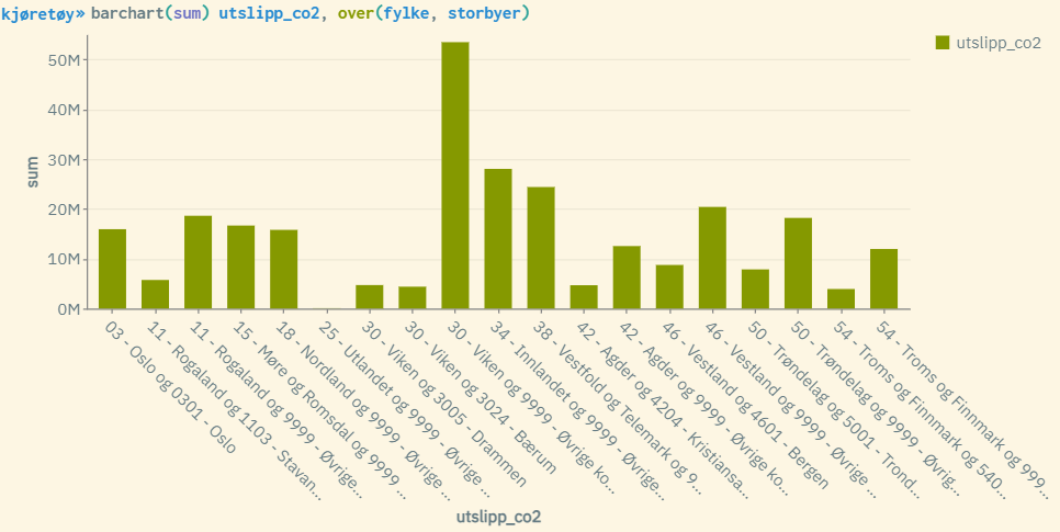
This variant of barchart can also be used in combination with the over() and by() options. Then, summary statistics are created for each category specified through a categorical variable specified inside the parenthesis. The stack option is not compatible with summary statistics.
Examples:
Horizontal display
Through the horizontal option, you can create horizontal views of bar charts.
Examples:
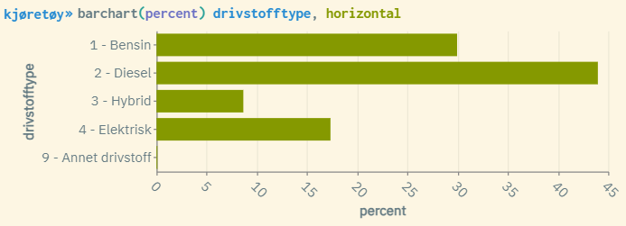
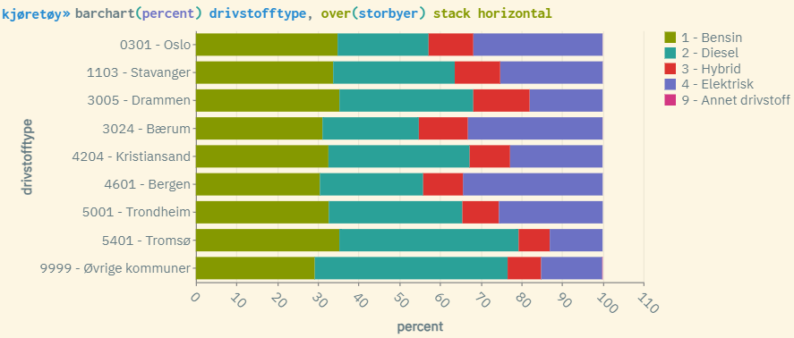
As with other graphical presentations in microdata.no, you can get the corresponding values by holding the mouse pointer over the different fields in the figure.
For more information about this command, use the help barchart command. This will show syntax examples and a complete list of available options that can be used to customize the appearance of the statistics generated.
Practical examples of using barchart: