4.4 Histogram - graphical frequency presentation
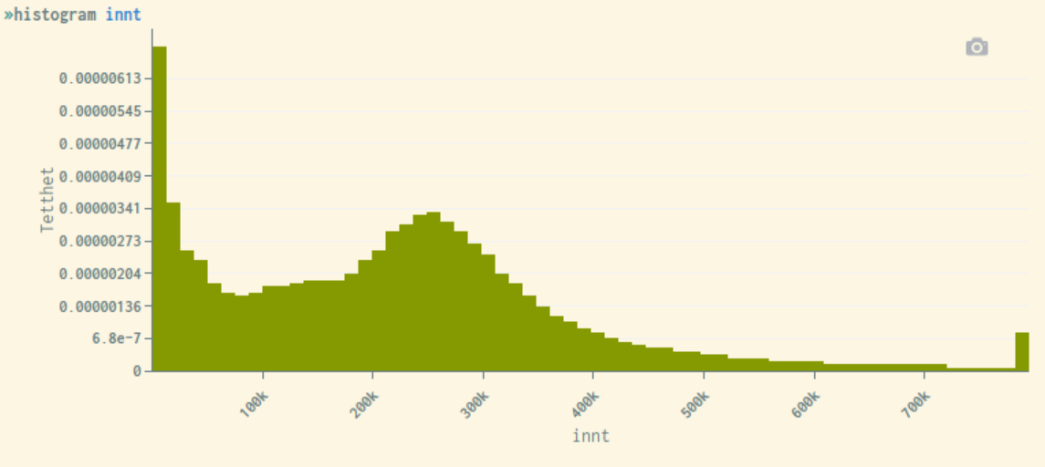
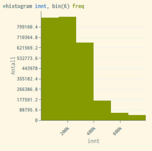
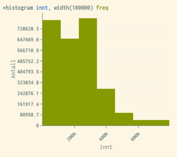
Histograms are graphical representations of univariate distributions for continuous variables (e.g., income). Each bar represents the frequency value for the corresponding predetermined variable interval. Through the options bin() and width(), it is possible to adjust and specify the number of bars and the interval width respectively. This is illustrated in the examples below.
The default display shows density as the frequency value. This can also be customized through options, in order to change the unit of
measurement on the y-axis into actual frequency (number), proportion, or percentage. The following options can be used for this: freq, fraction, percent.
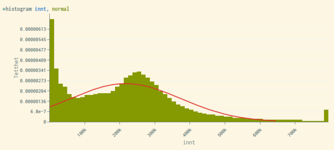
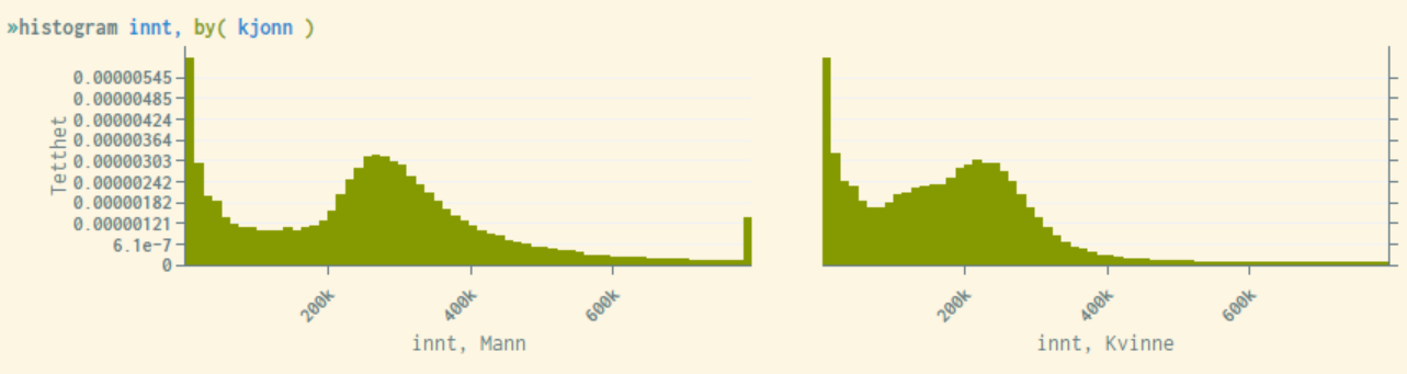
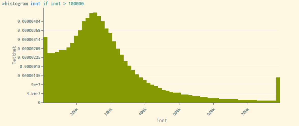
People with very high or very low income can easily be identified if the range of values becomes too narrow, which is problematic in terms of privacy. Therefore, the system performs a top/ bottom coding where the 1% highest and 1% lowest values are replaced by the respective limit values. Thus, the first and last bars will always be much higher than the neighboring bars, as illustrated in the examples below. This top/bottom coding is discussed in detail here.
Example:
By holding the mouse cursor over the various bars in the diagram, the respective bar intervals and frequency values will be shown.
Histogram showing income distributed over 6 intervals, and frequency numbers on the y-axis (each bar has the same income interval width):
Histogram showing income where each interval width are set to 100'000:
Through the option normal, a normal distributed curve is placed over the bars in the figure. This is helpful to study the degree of deviation from a normal distribution:
Histograms can be displayed over distributions for another variable that must be categorical, e.g. gender. This is done through the option by(<variable>).
Example:
Like other statistical representations in microdata.no, filtering can be performed through if-conditions, where the histogram is shown only for a sub-population.
Example showing histogram only for individuals with an income above 100,000 nkr:
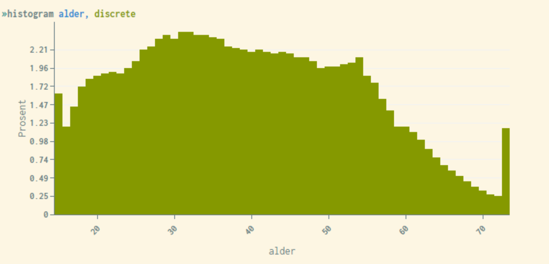
As mentioned, the histogram by default will divide into a predetermined number of bars/ intervals. Through the option discrete, this can be adjusted to display a bar for each individual value. This is not appropriate for metric variables of economic nature (number of bars becomes very high). However, for numerical variables with a limited number of values, this representation is highly recommended. Examples of variables may be age, percentages, or amounts that are rounded to the nearest 10,000 or 100,000.
Example of using the option discrete for the variable "age" (note that the system also in this case ensures that the first and last bars are top/bottom coded, since people of very low/high age are relatively easy to identify):
Histograms that combine bin() and discrete will return a blank diagram or an error message since these two options are not compatible together.
For more information about this command, use the help histogram command. This will display syntax examples and a complete list of available options that can be used to customize the appearance of the statistics generated.